A routine questionnaire answer turned out to be the clearest explanation of why the business existed. Building the website meant noticing that, not improving on it.
Before I talk to a founder, I send a short questionnaire about their business, their customers, and their website goals. It's not meant to replace the interview. It gets the basic details out of the way, preps the founder for our conversation, and gives me enough to ask better questions, so the interview can be conversational instead of bogged down in facts I already have.
Most answers are useful. Occasionally one stops you.
Mia's did. She runs SortednSupported, a business helping working moms reduce the mental noise of balancing careers and managing a household. Asked about her mission, she wrote:
"The work-family-home juggle is so crazy, particularly here in the US. It's as if all mums are set up for failure, and I think that's such a shame."
Nothing about that sentence was written for a website. It wasn't polished. It wasn't reaching for a tagline. It read like something she'd say to a friend over coffee. Which is exactly why it worked. It was the clearest thing anyone had told me about why the business existed, and she had typed it into a form field before we even met.
Her placeholder site didn't have any of that in it. It described the mechanics of the business — handling errands, organizing a household. It described a service rather than a relief.
Going into the interview, I already suspected the site was underselling what she did. Mia knew it too. That's why she hired me.
What I needed from the interview was for Mia to show me, in her own words, that the questionnaire line wasn't a one-off. It wasn't. The more she talked, the clearer it became that "organizing" undersold the job by a wide margin. She was taking on executive-level household responsibility, carrying the invisible weight that keeps a home running. That became the emotional center of the homepage copy.
Relief wasn't a side effect of what she did. It was the product.
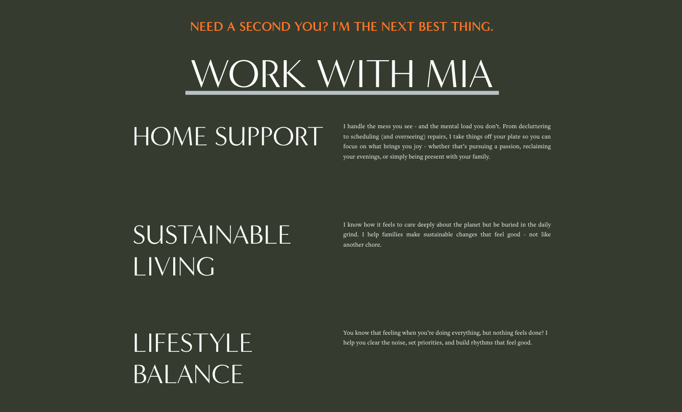
The earlier SortednSupported website organized services into three broad categories.
But a homepage can't run on emotion alone. Clients want to know, in concrete terms, how that relief actually gets delivered. Mia didn't have a clean sense of her own service categories, so I had her list every task she handled, then grouped it into categories and wrote it in language people actually search for.
The homepage explained why it mattered. The services page explained how it worked.
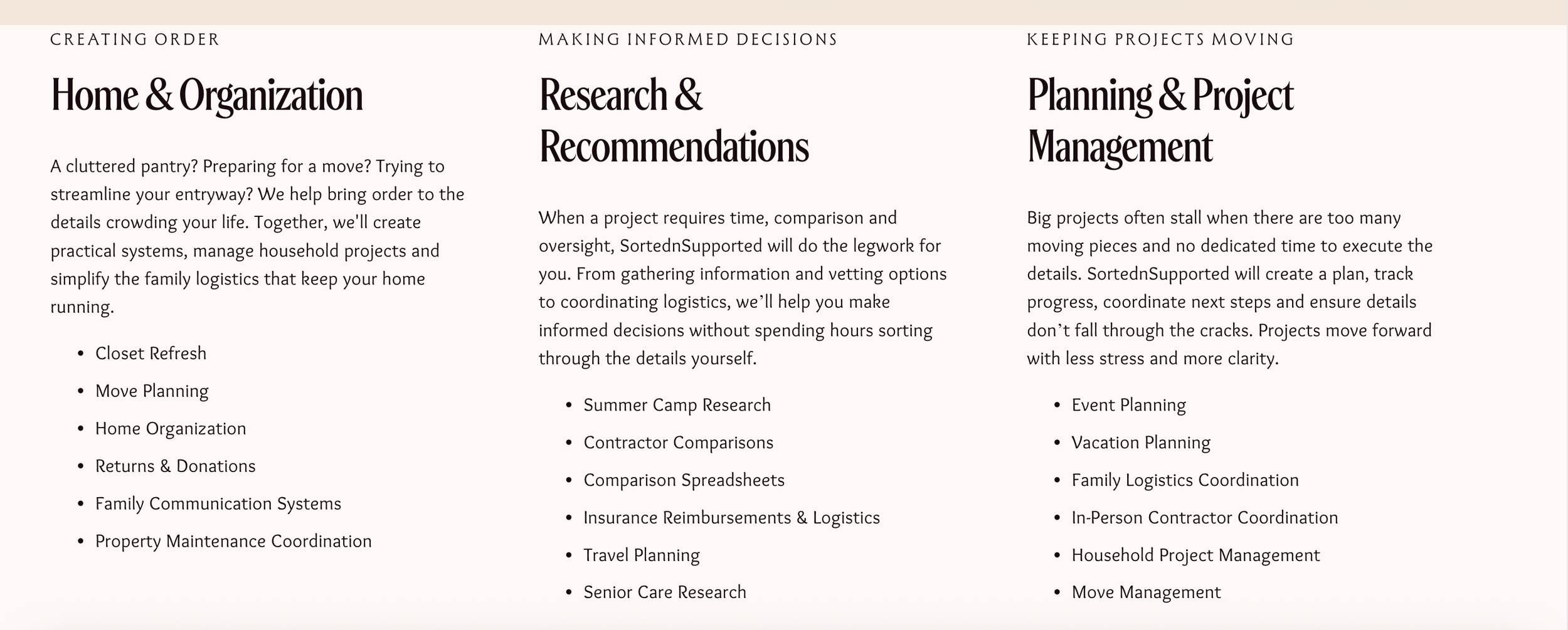
The new website clearly defined services and reorganized those services around the work clients actually need.
What stayed with me from this project wasn't the interview. It was that the real line was already sitting in a form Mia filled out on her own, before I'd asked a single question. The work was recognizing it, then following it far enough to see what else it could explain.